

This might be a simple question, but have you
ever stopped and wondered, how do we perceive
the world around us?
Well, the answer is not as simple. The perception
process can be more complex than it seems.
Think of it as the sensory experience of the world.
It’s the way we recognize our environment and
how we react to it.
In basic terms and for the purpose of this article,
perception involves the five senses: touch, sight,
sound, smell, and taste. They all play together
continuously and mostly unconsciously in a
sequence of steps that begins with the
environment and leads to our perception of a
stimulus and action in response to the stimulus.
We will focus on sight, as the subject of our
attention will be color. Without getting too
technical, the way we see and understand things
is as follows: We look at something, that image is
transformed into an electrical signal which is then
interpreted by our brain, and finally, an action,
whether physical or emotional, will be triggered.
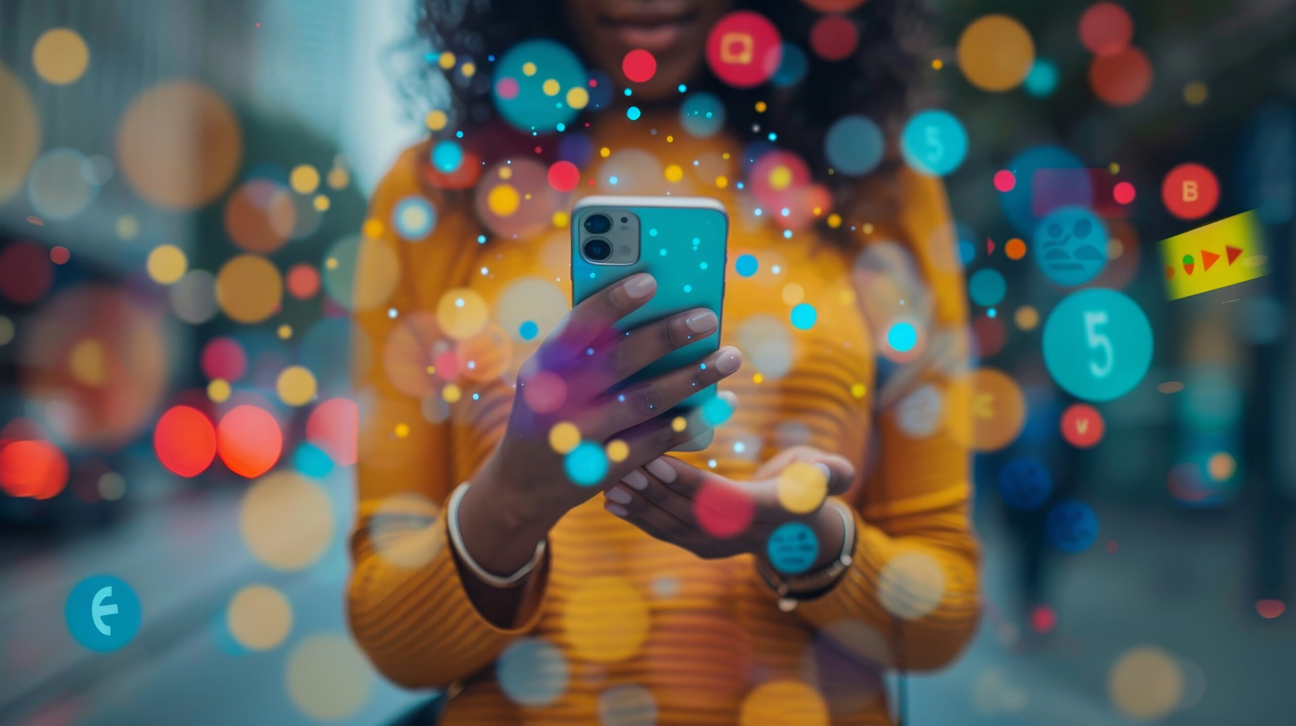
Color is everywhere, and we need to understand
the psychological effect it has on people because
it plays an important role in how your brand is
perceived. Color psychology studies the effect of
colors on human behavior.
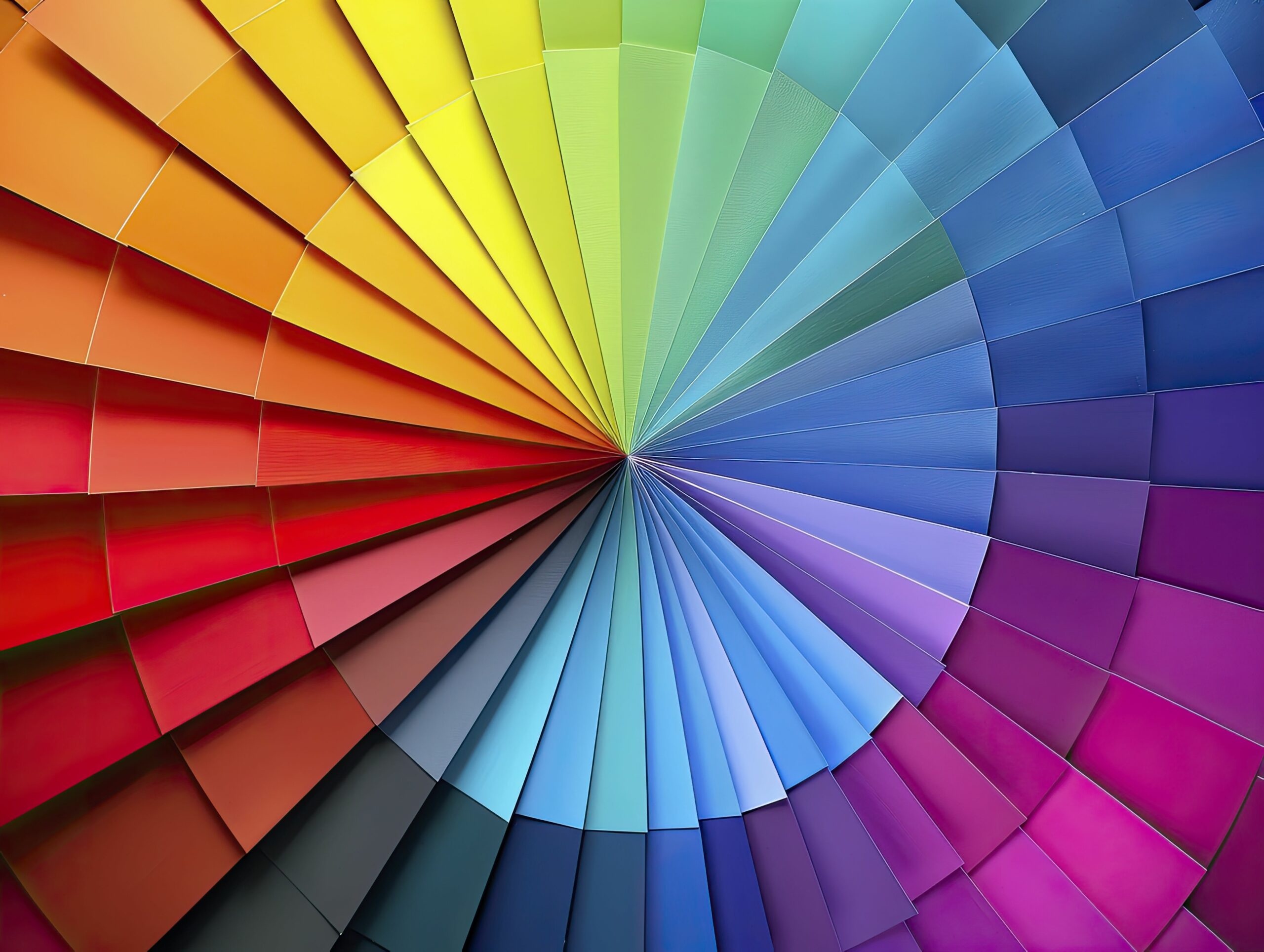
The color wheel features two types of colors:
warm tones and cool tones. Warm tones include
red, orange, and yellow; and are associated with
energy, passion, and creativity. Cold colors include
green, purple, and blue; and have a calming,
soothing effect on people.
There is another type of color that is not
represented on the traditional color wheel:
neutral tones. Neutral tones include white, grey,
and brown. Colors can evoke specific reactions
and feelings. Your color palette can influence how
customers feel about your brand. Subtle changes
in color schemes, distribution, and arrangement
can influence sales, conversion, reliability, and
brand loyalty.
There’s nothing mellow about Yellow!
Psychologically, this is the strongest color. It
stimulates mental process, encourages
communication, increases cheerfulness and
confidence. It’s an attention grabber, however;
too much yellow may cause anxiety. Brands will
usually use yellow on happy news
advertisements, like “free shipping” or “grab yours
now” and “redeem here."
True Blue!
Blue is the color of the mind. It inspires loyalty
and is essentially soothing. It curbs appetite and
represents calmness and serenity. It increases
productivity, and it creates a sense of security and
trust. Many major brands known for durability,
strength, and reliability use blue on their
branding.
Red, Of Course!
Red is a powerful color, an attention grabber.
When you see or think of red, it evokes strong
emotions, it increases the appetite and the heart
rate. Red symbolizes love, passion, danger, thrill,
action, excitement, and energy. It creates a sense
of urgency and it’s related to survival, safety, and
alertness. Brands use this color on their “call to
action buttons” or to promote special sales and
limited-time offers.
Go Green!
Green is easy on the eyes. It is the color of balance.
It signifies growth, health, fertility, wealth,
generosity, and tranquility. It denotes nature and
alleviates depression. It can also be associated
with negative connotations such as jealousy and
envy
Thereʼs a shade of Purple
This color combines the stability of blue and the
energy and power of red. It’s the color of royalty,
success, power, wealth, wisdom, creativity,
mystery, and regeneration. Purple can be
invasive, and too much of this color invites
distraction and introspection. Most successful
brands that use this color fall in the category of
luxury, and they use a splash of purple across their
branding.
Think Orange!
It reflects enthusiasm and excitement and shows
warmth. It’s also the color of caution. Brands with
orange are viewed as cheerful and confident.
Orange is often representative of creativity,
happiness, freedom, and success. It is a
combination of red and yellow, therefore it
provokes both the physical and the emotional.
Keep that in mind for branding purposes.
White as Snow, said the Queen!
It denotes cleanliness, purity, and safety and can
be used to project neutrality. It’s the most
common color used by marketers when
advertising coupons and price discounts. In fact,
some of the biggest global brands like Google use
white to create contrast on their home pages.
White is the color of clarity, freshness, and used to
spark creativity.
Once you go Black…
Black is the absence of light, and it can be
menacing. But when used cleverly, this is the
color of sophistication, mystery, uniqueness,
boldness, and control. It’s the color used to sell
sleek and high-end items. When used too much,
it can be subliminally repulsive as it will denote
negativity and oppression. When branding, this is
also a great color to use in combination with all
others as it subtly draws attention.
Donʼt frown upon the Brown!
Brown is also a neutral color. You get it by mixing
red, yellow, and blue, so think about those
It is important to keep in mind that the same
color can also have different meanings that are
dependent on our upbringing, gender, location,
values, and a variety of other factors. Also, the
shade of the color will have a different perception,
and remember that if chosen correctly, your color
palette can influence how customers feel about
your brand.


Si


5 Responses
Si
el aguacate es una fruta
asdasd
Se ve bien
Nitido