
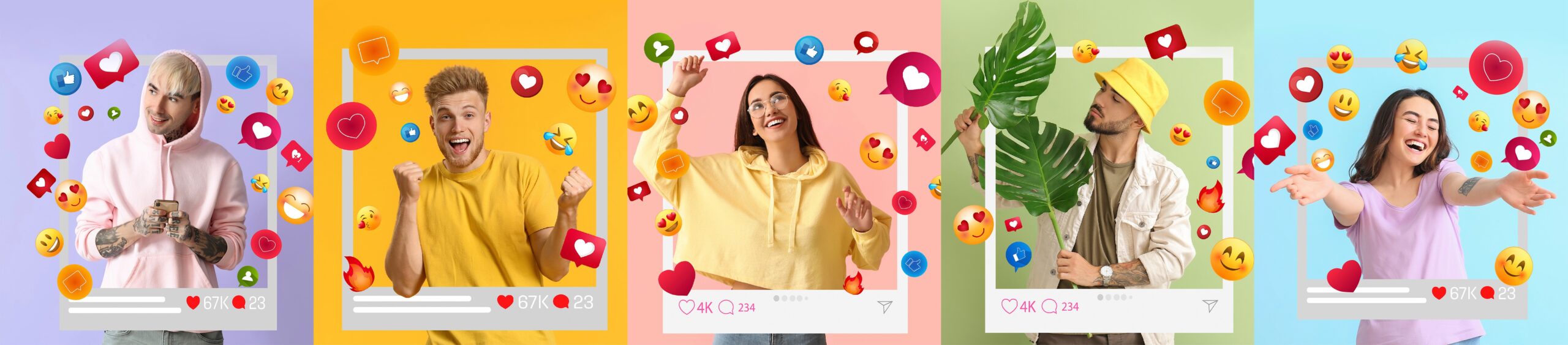
Have you ever stopped to think about colors’ role in social media design? Colors have a powerful impact on our emotions and can greatly influence user engagement. This article will explore the art of color psychology in social media design and how you can master using colors to drive engagement.
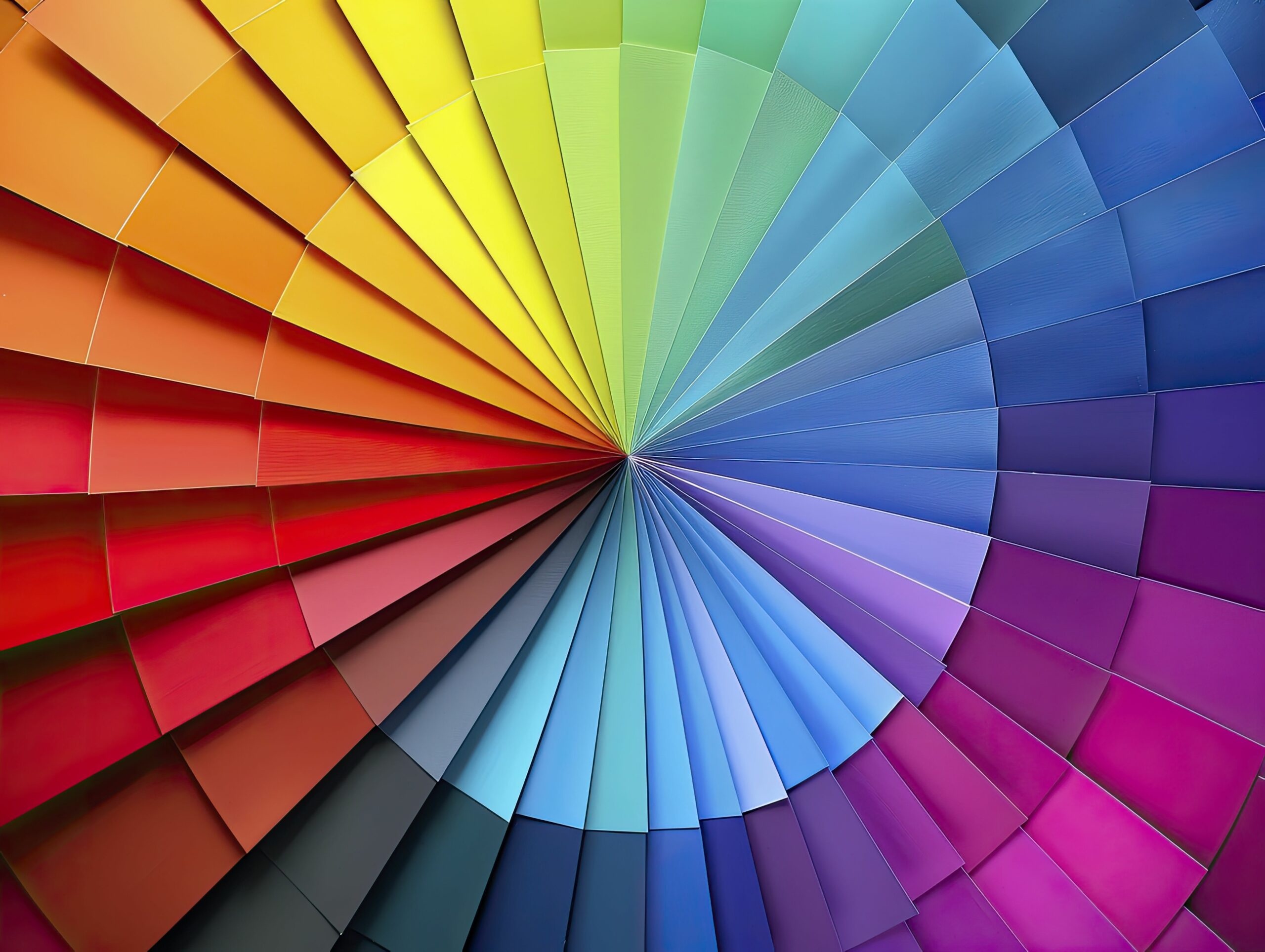
Colors have the ability to evoke emotions, stimulate the senses, and convey messages without the need for words. This is why understanding the psychology behind colors is crucial when designing social media content. Different colors have different meanings and can elicit specific emotional responses from users. For example, warm colors like red and orange are often associated with energy, passion, and excitement, while cool colors like blue and green evoke feelings of calmness and tranquility.
There are varying ways that designers use colors in their work to convey different messages. However, the following are the most prominent;
1. Warm Colors
In design, warm colors arouse emotions of passion, energy, and excitement. They include red, orange, and yellow colors, creating a sense of urgency and attention. These colors are perfect for attracting attention, but a designer should use them carefully, as too many can cause strain.
2. Cool Colors
Cool colors like blue, green, and purple evoke calmness and relaxation, making them popular choices in the healthcare, beauty, and finance industries. When used correctly, they can convey a sense of stability and trustworthiness.
3. Neutral Colors
Neutral colors such as gray, beige, black and white are often used as a backdrop because they help to balance a design and provide contrast. They evoke a sense of sophistication that is perfect for luxury, fashion, and beauty brands.
4. Complementary Colors
Designers use complementary colors to create contrast and excitement in their work. Complementary colors sit opposite each other on the color wheel, such as blue and orange or red and green. Using these colors together can create a harmonious effect.
5. Monochromatic Colors
Monochromatic colors are derived from one base hue, and designers use them to create a consistent and harmonious look. They are perfect for minimalist designs and evoke simplicity and elegance.
Choosing the right colors for your brand can help you attract your target audience, increase engagement, and generate more leads. In this blog post, we’ll discuss the power of color in social media design and how to choose the right palette for your brand. Colors can evoke emotions and help brands to stand out. In this post, we’ll dive deeper into the power of color in social media design and provide tips to help you choose the perfect palette.
Design colors influence how we perceive and interact with the designs we see. When used correctly, they can evoke emotions and communicate meaning, making them a critical component in any visual communication system. Understanding each color’s role in design is essential for any designer.
Now that you know these color basics, you can use them to choose the perfect colors for your design while still conveying your message and evoking the emotions you desire. So whether you’re designing a logo, a website, or a poster, your choice of colors can make an immense difference in how your design communicates with its audience. Thus, it’s essential to take some time to think about which colors to use and what emotions you want to convey before beginning the design process; here, you can find some extra important elements to think about when choosing a color pallet.
Understand color psychology: Different colors evoke various emotions, and you need to understand the psychology behind each color before deciding which color palette best suits your brand. For instance, blue represents trust, security, and loyalty. Red, on the other hand, represents passion and excitement and creates a sense of urgency. Yellow evokes energy, optimism, and warmth, while green represents growth, balance, and tranquility. By understanding the emotions that different colors evoke, you can choose the right colors to convey your brand message.
Know your target audience: Understanding your target audience’s demographics, psychographics, and culture is crucial when choosing your brand’s color palette. Different cultures perceive colors differently. For instance, while red is associated with excitement and passion in Western culture, it signifies good luck in Chinese culture. By understanding your target audience, you can tailor your color palette to suit their preferences, thus increasing brand engagement.
Use color contrast: Color contrast is critical in attracting social media users to your brand. Contrasting colors create visual interest and make your content stand out. Using high-contrast colors for vital elements such as call-to-action buttons and captions help them stand out and makes them more clickable.
Be consistent: Consistency is crucial when developing your brand color palette. Using consistent colors across your social media platforms and website helps to strengthen your brand identity and user loyalty. Ensure your color palette is consistent with your brand image, tone, and messaging.
Test and Experiment: Sometimes, you may be unsure about your brand’s color palette, so testing and experimenting is crucial. Different colors may evoke various emotions depending on the product, service, or message being conveyed. By testing different colors, you can gather valuable information on what works best for your brand and audience.
Creating visually appealing social media designs doesn’t have to be complicated. There are a variety of tools and resources available that can help you bring your creative vision to life. Websites like Coolors and Color Hunt provide inspiration and generate color schemes based on your preferences. These tools can be valuable assets in creating eye-catching and aesthetically pleasing social media designs.
Color psychology impacts user engagement and plays a significant role in brand recognition and loyalty. Consistent use of colors across your social media channels helps establish a strong brand identity and makes your content easily recognizable. When users consistently associate your brand with certain colors, it enhances brand recall and fosters a sense of trust and familiarity. By leveraging color psychology, you can strengthen your brand’s presence on social media and cultivate a loyal following.
Now that you understand the importance of color psychology in social media design, it’s time to put your knowledge into practice. Experiment with different color palettes, test their impact on user engagement and analyze the results. By continuously refining your social media designs and leveraging the power of colors, you can create a captivating and memorable brand presence that resonates with your audience.
If you need consulting for building your brand, you can get a free consultation with our team.